Author: Struggle in the City Team
What is poverty?
At first glance, this may seem like a very simple question. In reality however, it has been the subject of debate among academics and policy-makers for decades (Spicker 2004). Should poverty be characterized as a low standard of living? A socio-economic class? A dependency on social welfare? The concept is so complex in fact, that ministers in the UK have often defined it as “knowing it when they see it” (Gordon 2006).
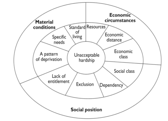 Figure 1. Family resemblances between different conceptualisations of poverty (Spicker 2007)
Paul Spicker’s wheel represents a great starting point towards gaining a better understanding of the multiple dimensions of poverty (see Figure 1). Here, the academic summarizes dominant interpretations of poverty in three distinct, but interlinked categories: Material conditions, economic circumstances and social position.
The first refers to a state of deprivation. Here, poverty is understood as the consequence of a lack of resources, namely as low standards of living and missing material goods (Spicker 2007). The second category refers to a lack of economic resources, either in the form of money or economic power, leading to a state of need. According to this school of thought then, poverty is understood as the root cause of resulting hardships (Spicker 2007). Lastly, within the final category, poverty is considered a consequence of suffering from material needs – the concept is equated to being unable to participate in society and make use of its opportunities and perks due to a lack of status and power or a dependency on social services (Spicker 2007).
Spicker’s wheel makes clear that poverty cannot be viewed from a single perspective. Instead, its manifestations are diverse, may stretch across multiple dimensions and are heavily context-dependent. As such, there is no single indicator that could ever adequately capture the complex realities of poverty in a single number.
If this is the case then, is there even a method with which we can attach statistics to Spicker’s wheel? The answer to this question is: yes.
Triangulating Poverty: Indices
A summary index is one way through which we can capture multiple dimensions of an issue using statistics. It consists of a set of standardized indicators which are eventually compiled to produce a single composite indicator (Spicker 2004).
It is important to keep in mind however, that adding more information also means losing certain details. In order to combine multiple indicators into an index, individual scores are often averaged or added together. This means that one factor might disguise the effects of changes in another. Other times, scores are assigned weights in a points scheme. This inherently introduces room for human error, as weights need to be assigned based on normative judgement (Spicker 2004). Don’t worry too much though: there are usually safeguards – such as the practice of intercoder reliability or trial periods – in place throughout the index creation process to keep its validity and reliability as high as possible (Spicker 2004).
A European Perspective: AROPE
In the context of the Netherlands there are several indices we can use to examine the contents of Spicker’s wheel. The first is called AROPE, or the “At Risk of Poverty or Social Exclusion rate.” This composite indicator is used by the EU to monitor its Europe-wide 2020 poverty target (Eurostat 2019). It is comprised of three sub-indicators, namely relative monetary poverty (AROP), being severely materially deprived (SMD) and living in households with very low work intensity (EAPN 2020). People are considered to be at risk of poverty or exclusion if they fall into at least one of these three categories.
The AROP indicator is based on the EU’s standard poverty line of 60 percent of a country’s median income. Any household falling below this income line is said to be at risk of monetary poverty. This indicator is a good first step towards creating a picture of the resources available to different parts of a population, however it does miss out on other important factors such as how far below the threshold a household falls, or how long it has stayed there (EAPN 2020).
AROP is complemented by the SMD indicator, meant to move beyond monetary indicators and better take into account the actual standard of living that people enjoy. The SMD indicator is based on a list of nine items that are considered necessary or desirable. These include to pay rent or utility bills, to face unexpected expenses, a washing machine or a color TV for example. If an individual cannot afford at least four of the nine items, they are considered severely materially deprived (EAPN 2020). While this indicator represents a step closer to a more complete picture of poverty, it is nevertheless somewhat limited in the small number and somewhat outdated nature of the items. This indicator is currently being updated (EAPN 2020).
Finally, the work intensity of a household indicator is meant to capture the proportion of people living in job-less or nearly job-less households. It is the ratio of the total number of months that all working age household members have worked during an income reference year and the total number of months those same members could have worked in theory. A household is considered to have a very low work intensity when this ratio falls below a threshold set at 0.20 (EAPN 2020).
In combination, the three indicators comprising AROPE therefore roughly cover the three major dimensions of poverty in Spicker’s wheel: AROP captures a lack of economic resources, SMD illustrates material deprivation and finally low work intensity – to a certain extent – captures social isolation due to being unable to participate in the labor market. When added together, these indicators result in a percentage. This number refers to the proportion of a given population considered to be at risk of poverty (BPB 2018).
Turning back to Figure 1 however, we can clearly see that the concept of poverty stretches far beyond these three, rough indicators. AROPE gives no indication of a household’s level of indebtedness, their access to public services or the state of their housing for example. The EU has recognized this shortcoming and created an extra set of indicators to supplement AROPE and cast a more complete picture of poverty in Europe. Here, indicators include information on access to health, school dropout rates, in-work poverty, as well as life expectancy or social protection expenditure for example. You can find these indicators and more, here.
Moving towards Regions: RHPI
While the AROPE indicator is great for drawing large-scale comparisons between EU member states, it is less suited for more detailed, regional analyses. This is where the RHPI comes in. The Regional Human Poverty Index is a composite indicator for the analysis of sub-national – or NUTS 2 – regions within the EU (Weziak-Bialowolska and Dijkstra 2014). There are twelve NUTS 2 regions in the Netherlands, which correspond to the twelve Dutch provinces – The Hague is located in Zuid-Holland for example.
The RHPI is comprised of four dimensions of human development covered by six indicators: A long and healthy life – captured by life expectancy at birth and infant mortality rate – knowledge – captured by the percentage of a population with low education attainment, or who are neither employed nor in education or training – a decent standard of living – illustrated through the long-term unemployment rate – and finally social exclusion, or the percentage of the population below the income poverty line (Weziak-Bialowolska and Dijkstra 2014). These four dimensions of poverty are given different weights. The scores are subsequently added together, meaning that the lower the score, the more poverty-stricken the region is (Weziak-Bialowolska and Dijkstra 2014).
The RHPI is an interesting tool in that it allows for comparisons of variability of poverty within and across EU countries. It therefore goes one step further than the AROPE indicator. When using this indicator and comparing its results to those of other indices, one should be careful of its nature however, as the choice of sub-indicators as well as weights are somewhat subjective. Thus far the EU has only published one round of RHPI results, however an annual update is in the works.
A Local Perspective: The CBS Report
Finally, perhaps the most detailed assessment of poverty in the Netherlands comes from Statistics Netherlands, or CBS. Every year the CBS publishes a report describing the Netherlands’ national state of poverty. While the CBS does not use an index per se, it does summarize the results of a range of indicators into one coherent result.
In order to assess the prevalence of poverty in the Netherlands, the CBS primarily focuses on two dimensions of Spicker’s wheel, namely economic circumstances and social relationships. Households burdened with insufficient economic resources are evaluated through the following indicators: a low-income threshold and purchasing power, amount of expenditure and alternative financial assets, as well as subjective estimates of one’s personal financial situation and a capital ceiling (CBS 2019). Combined, these indicators grant an overview over a household’s level of income, their spending and their wealth position.
The CBS recognizes that the concept of poverty stretches across more than just a material dimension. For this reason, it also seeks to place households identified as at-risk in a more complete social context. Their general living situation and social position are assessed on the basis of the following indicators: social participation, material conditions, living environment and quality, perpetrators and victimization of crimes (as an indirect indicator of norm awareness), as well as various indicators for health and lifestyle (CBS 2019).
While compared to the two previous indices the CBS’ assessment of poverty does not lead to a single digit result, it nevertheless provides a very useful impression of poverty in the Netherlands. Some of its most helpful features include an overview over poverty by socio-economic and demographic groups, as well as by municipality.
A Word of Warning
There is one important thing to keep in mind when using indices and indicators of any kind: Namely, that an indicator does just what its name suggests. It indicates, it does not measure.
The difference between an indicator and a measure is minute, yet important. A good measure needs to be accurate, or in other words reflect the very core of the thing it is measuring. An accurate measure will therefore mimic the trends and patterns of the concept it is observing exactly. A good indicator on the other hand, reflects the characteristics of an issue – that is to say, it measures concepts adjacent to the issue in question. An indicator or index therefore points towards trends and relationships, but we can never be 100 percent sure that it corresponds perfectly with the core of the issue it is observing.
Turning back to the original question then: How much of Spicker’s wheel can we explain using statistics? If the indices introduced above are any indication, actually a quite sizeable amount. In fact, as long as we get specific enough in our requests, there is usually a corresponding indicator out there, created just to examine the very trend we seek to examine. It is important to remember however, that converting the human experience into numbers is always accompanied by simplification and an increased distance from the situation on the ground. So while we can offer a rough overview of the various manifestations of Spicker’s wheel using statistics, if we want to capture its human element, we will have to turn towards other sources of information.
References:
BPB (2018). “Armut oder soziale Ausgrenzung: der AROPE-Indikator.“ Bundeszentrale für politische Bildung. At https://www.bpb.de/nachschlagen/datenreport-2018/private-haushalte-einkommen-konsum-wohnen/278267/armut-oder-soziale-ausgrenzung-der-arope-indikator.
CBS (2019). “Armoede en sociale uitsluiting 2019.” Centraal Bureau voor de Statistiek. At https://www.cbs.nl/nl-nl/publicatie/2019/50/armoede-en-sociale-uitsluiting-2019.
EAPN (2020). “How is poverty measured?” European Anti-Poverty Network. At https://www.eapn.eu/what-is-poverty/how-is-poverty-measured/.
Eurostat (2019). “Glossary: At risk of poverty or social exclusion.” Eurostat Statistics Explained. At https://ec.europa.eu/eurostat/statistics-explained/index.php/Glossary:At_risk_of_poverty_or_social_exclusion_%28AROPE%29.
Gordon, D. (2006). “The concept and measurement of poverty.” In Poverty and Social Exclusion in Britain by C. Pantazis, D. Gordon and R. Levitas (eds.), Bristol: The Policy Press, 29-69.
Spicker, P. (2004). “Developing indicators: issues in the use of quantitative data about poverty.” Policy and Politics 32(4): 431-440.
Spicker, P. (2007). The idea of poverty, Bristol: Policy Press.
Weziak-Bialowolska, D. and Dijkstra, L. (2014). “Regional Human Poverty Index – Poverty in the regions of the European Union.” JRC Science and Policy Reports. At https://ec.europa.eu/jrc/sites/jrcsh/files/final_version_online_22082014.pdf.